Drawing a simple map in R: Step by step
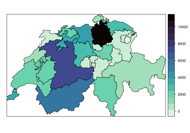
Let’s draw a simple map of where Ukrainian refugees are concentrated in Swiss cantons. Given that Ukrainian refugees are allocated to cantons proportionally the population, we’ll end up with a map of the population more generally, but that’s not really the point of this post.
We’ll need data, which we’ll download from the State Secretariat for Migration SEM: https://www.sem.admin.ch/sem/de/home/publiservice/statistik/asylstatistik.html In the example, I use the spreadsheet 6-24-Best-S-Erwerb-d-2022-10.xlsx as of October 2022.
We’ll need a shape file of the Swiss cantons, which we’ll download from GADM: https://gadm.org/download_country_v3.html. These shape files are descriptions of the polygons that define the shape of the cantons in the map.
And we’ll need R, which obviously already runs on our computer ;-). To make our lives easier, we’ll use three packages:
library(sp)
library(viridis)
library(readxl)
The first is for using shape files, the second one provides a specific colour scheme, and the third one is for opening Excel documents.
We’ll start with importing the data from the spreadsheet. If the spreadsheet is located in the working directory (the same directory where the code is placed), we can run the following code.
ukr = read_excel("6-24-Best-S-Erwerb-d-2022-10.xlsx", sheet="CH-Kt", range="A4:E33")

ukr = data.frame(ukr)      # not as tibble

ukr = ukr[-1,]             # spare column from import

names(ukr) = c("Canton", "Total", "Personen", "Erwerbstätige", "Quote") # variable names
We specify the sheet and range to get a more manageable import. Here, I explicitly change the data to a standard data.frame, and then remove the row numbers in the first column. I also specify variable names. At this stage, head(ukr) it will be useful to check the data look as they should.
Next up is the shape file.
cantons = readRDS("gadm36_CHE_1_sp.rds")
The fiddly part of drawing maps is getting the data and the shape file agree on names. We can get the exact spelling of the cantons used in the shape file by checking cantons$NAME_1.
Next, I’m renaming those cantons that are spelt differently. In the first line, I duplicate the name of the cantons into a new variable called NAME_1. In the subsequent lines, I replace those names, that do not match:
ukr$NAME_1 = ukr$Canton

ukr$NAME_1[ukr$Canton=="Appenzell I. Rh."] = "Appenzell Innerrhoden"

ukr$NAME_1[ukr$Canton=="Appenzell A. Rh."] = "Appenzell Ausserrhoden"

ukr$NAME_1[ukr$Canton=="Basel-Land"] = "Basel-Landschaft"

ukr$NAME_1[ukr$Canton=="Freiburg"] = "Fribourg"

ukr$NAME_1[ukr$Canton=="Genf"] = "Genève"

ukr$NAME_1[ukr$Canton=="Luzern"] = "Lucerne"

ukr$NAME_1[ukr$Canton=="Neuenburg"] = "Neuchâtel"

ukr$NAME_1[ukr$Canton=="St. Gallen"] = "Sankt Gallen"

ukr$NAME_1[ukr$Canton=="Tessin"] = "Ticino"

ukr$NAME_1[ukr$Canton=="Wallis"] = "Valais"

ukr$NAME_1[ukr$Canton=="Waadt"] = "Vaud"
Now that the data and the shape file have the same names, we can merge them. I create a subset to get rid of DK and the total row — this step is optional in many other situations, but it doesn’t hurt. Then I order the data to match the order in the shape file, and simply copy over the values (which are now in the same order as the shape file) into the shape file. If I’m more adventurous, I use merge() directly, but generally, I like code where I can trace what’s going on step by step.
ukrval = subset(ukr, ukr$NAME_1 %in% cantons$NAME_1)

ukrval = ukrval[order(cantons$NAME_1),]

cantons$data = ukrval$Total
In this example, I want a custom colour palette (I picked the one called “mako”), using viridis. I could also use a different palette, or something built in. Here I had to reverse the colours using rev() to have darker colours for higher values, at other times I want them the original way around — this takes a bit of tinkering (or thinking).
col = rev(mako(28))
The last thing to do is to use spplot() to draw the map.
spplot(cantons, "data", col.regions=col, main="", colorkey=TRUE)
Bonus: to get rid of the frame, we can use this code:
spplot(cantons, "data", col.regions=col, main="", colorkey=TRUE, par.settings=list(axis.line=list(col="transparent")))
This being R, there will also be different ways to draw maps…
Published 2 March 2024